How to explore generational (cohort) effects in drug overdose fatalities
Since fentanyl overdose deaths began to rise in 2013, older Black people have died of overdose at some of the highest rates nationwide. But a new analysis of CDC Wonder mortality data has identified a cohort effect in dozens of U.S. counties where Black men born between 1951 and 1970 have died of overdose at exceptionally high rates for decades.
The Baltimore Banner, in partnership with The New York Times’s Local Investigations Fellowship and The Upshot, along with Stanford’s Big Local News, worked with nine local newsrooms across the country to investigate some of the largest effects. You can read more about the findings at The Upshot and The Banner. This is an extension of The Banner’s initial story that revealed the scale of the crisis for this generation in Baltimore.
The local media partners that published reports about the opioid crisis in their regions in December 2024 include:
- The Chicago Sun-Times
- NJ.com/The Star-Ledger
- The Philadelphia Inquirer
- PublicSource (Pittsburgh)
- The San Francisco Standard
- The 51st (Washington D.C.)
The local media partners that published reports about the opioid crisis in their regions in January 2025 include:
What we found
Investigating these trends uncovered what epidemiologists call a cohort effect: a disease or disparity that is especially common among people born at the same time. Using a statistical model, Times and Banner reporters found such an effect among overdoses for Black people in this age group in Baltimore. A wider analysis then identified the same cohort effect in dozens of other counties.
Former Baltimore Banner data reporter Nick Thieme was able to analyze overdose patterns in every large county in America by combining academic data on U.S. deaths with population counts by age and gender.
The result is a dataset that allowed The Banner team to calculate death rates by single-year of age, race, sex, and location, for any cause of death, for any county in the United States from 1969 to 2022. This is likely the only dataset of this kind in existence. Big Local News is hosting a suppressed version of the underlying data aggregated by county in the Stanford Digital Repository, along with this guide on how to use the data for further reporting.
How to view the data for your city
To look up counties in your coverage area, download the data from the Stanford Digital Repository in partnership with Stanford’s Big Local News.
The data includes overdose counts and rates for the 408 U.S. counties that had 200 or more overdose deaths between 2018 and 2022, the last year data was available.
First, filter the data for the states you want to look at. We’ll use Maryland as an example in a Google spreadsheet. You can follow the same general steps using Excel.
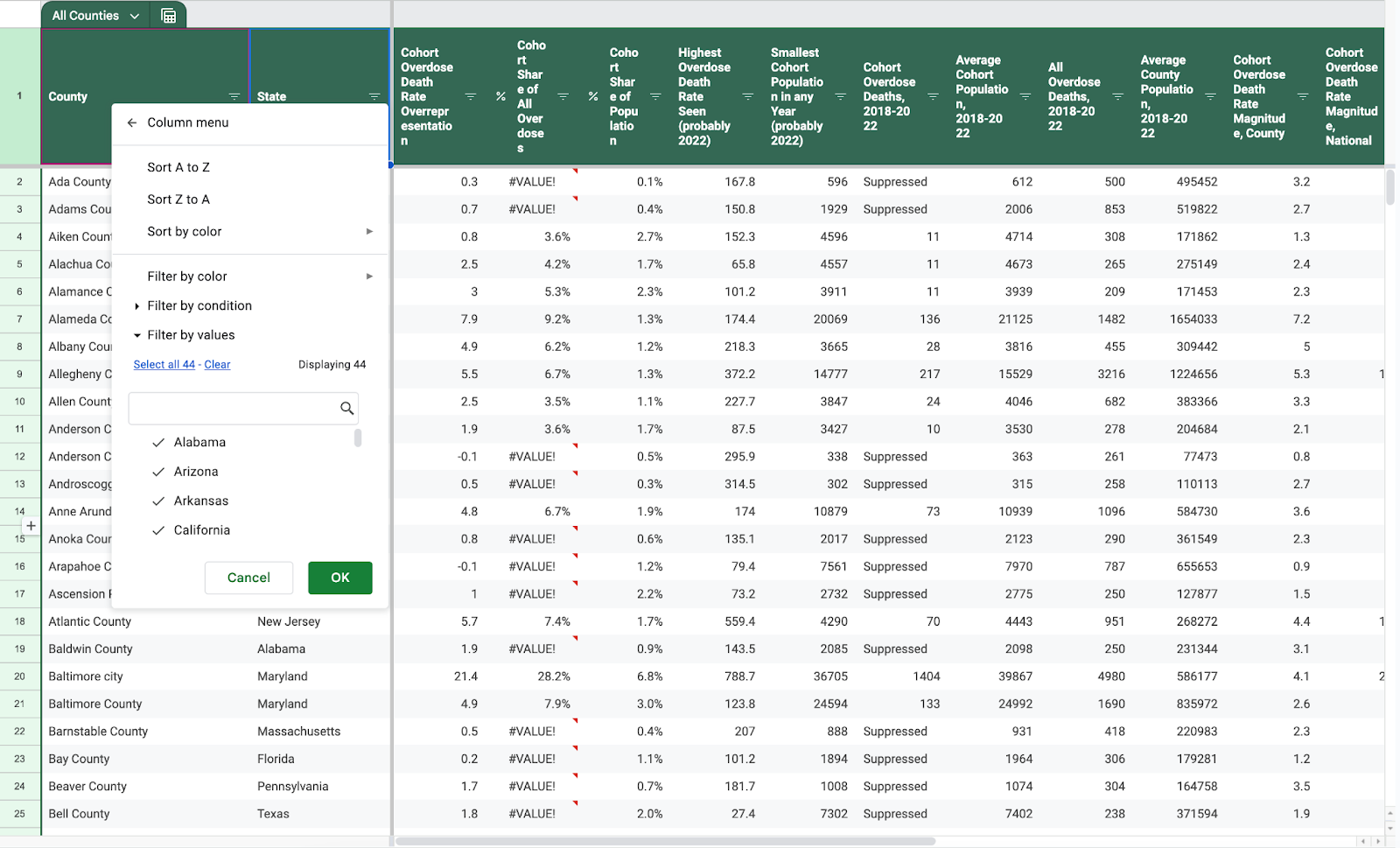
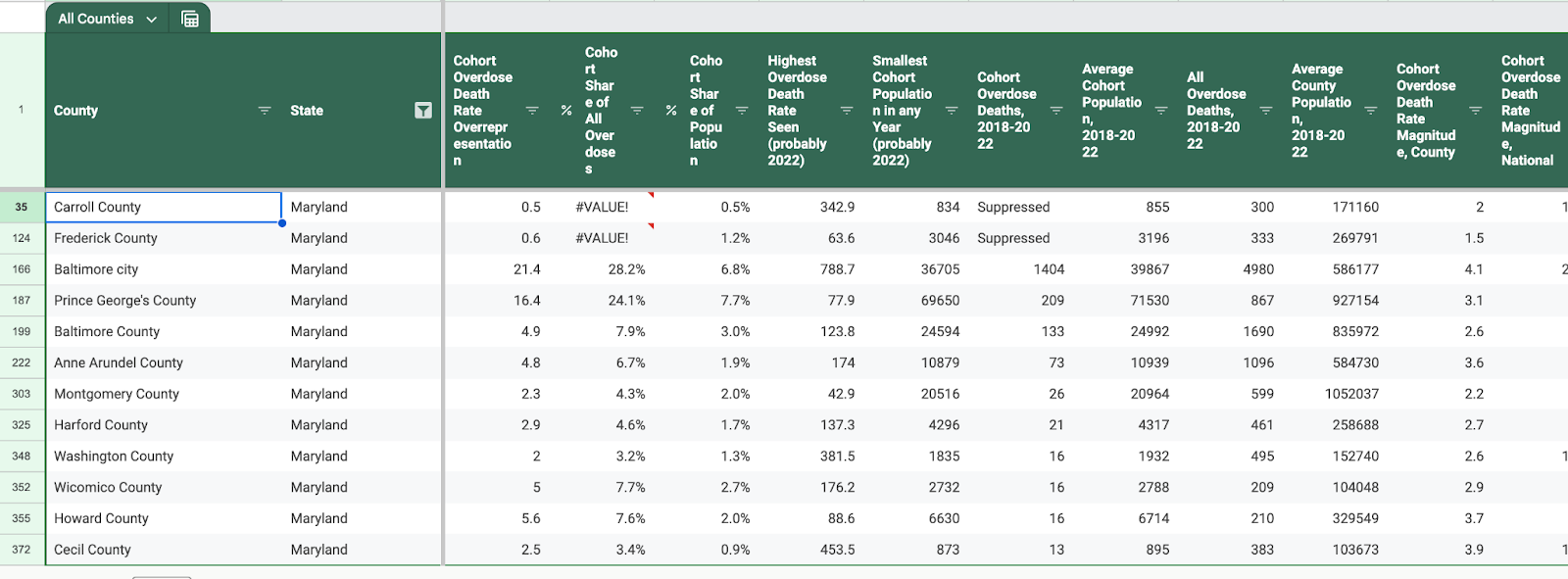
After filtering for Maryland, you are left with the 12 Maryland counties that had 200 or more overdose deaths. The other 12 Maryland counties had fewer deaths, so few that one or two deaths might create very large rates.
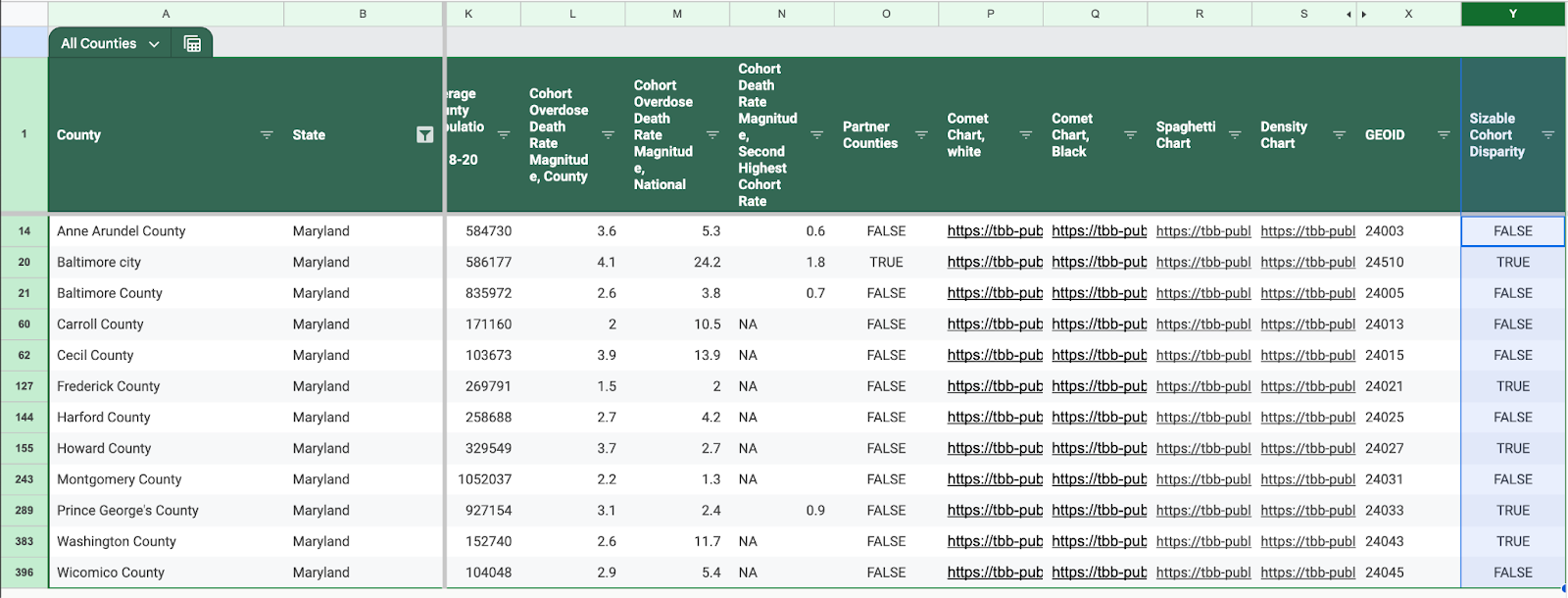
Now scroll over to the last column in the spreadsheet. The “Sizable Cohort Disparity” column defines if a given county has the cohort effect. This is the result of a model and some subjective analysis. You can read more about our methodology here.
Focus your data reporting on Cohort Overdose Death Rate Overrepresentation and the magnitudes of the death rate. The overrepresentation calculates the disparity of overdose deaths by taking the share of all overdose deaths by this one generation of Black men and subtracting their share of the overall population. The higher the number, the greater the disparity. In the regions analyzed within the partnership, this number tends to be highest in counties with large Black populations.
One way to easily explain this in a story is to use two additional key numbers from the spreadsheet: Cohort Share of Population and Cohort Share of All Overdoses and then reference the Cohort Overdose Death Rate Overrepresentation. For example: Black men born in Cook County, Illinois, home of Chicago, between 1951 and 1970 account for just 2.4% of the population. But that same group accounts for nearly a quarter of (23.5%) all overdose deaths, the fourth highest disparity in the country.
The magnitudes attempt to show the disparity by comparing the overdose death rates of Black men born between 1951 and 1970 with the overdose rate for all Americans, the overdose rate for the entire county and the overdose rate for the next most affected generation of men.
We have also included charts you can publish with your story:
- Density Charts: Charts showing the average overdose death rate by birth year for different races
- Spaghetti Charts: Line charts over time of overdose death rates by generation and race
- Comet Charts: Charts showing the average overdose death rate by birth year for different races.
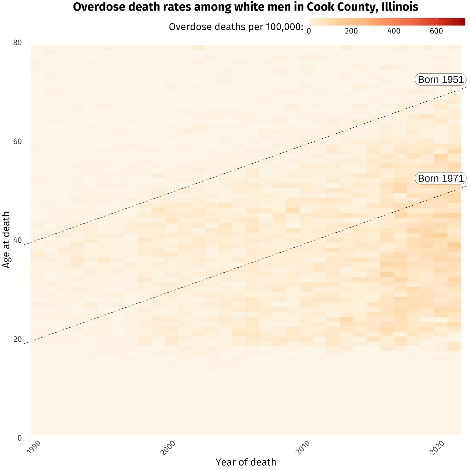
The most powerful are the “comet charts.” These plot overdose death rates by year and by age. The intensity of a cohort effect is defined by a general upward trend of darker colors for ages and years that correspond with Black men born between 1951 and 1970, as seen below in the chart for Cook County, home to Chicago.
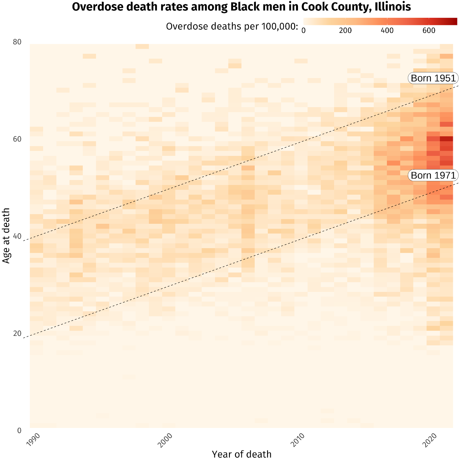
Comet charts that don’t show a cohort effect tend to have a more uniform, horizontal intensity, like white men in Cook County (Chicago).
When you reach out to local experts, we recommend sharing the data and the methodology with them.
If you have questions, please email Cheryl Phillips at [email protected] or [email protected].


