Grades of Heat documents the environmental legacy of redlining
How to report on vulnerable communities through the environment? The answer is with data.
“Understanding environmental science and reporting it properly is challenging. And working with environmental data, especially when it comes to satellite imagery, can be really technically challenging and an impediment to most journalists,” said Michael Krisch, deputy director of the Brown Institute for Media Innovation at Columbia and Stanford Universities.
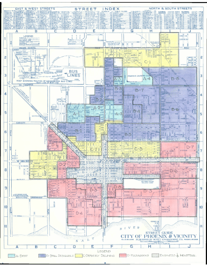
That is why Krisch has developed “Grades of Heat.” The project, supported by the Brown Institute, explores the relationship between Home Owners’ Loan Corporation grades –assigned to neighborhoods by the Home Owners’ Loan Corporation back in the 1930s as part of The New Deal– and environmental conditions such as temperature and vegetation.
These grades categorized neighborhoods on a scale from A to D. This classification not only assessed lending risks but also had a lasting impact on perceptions and policy decisions, heavily influenced by the racial composition of these areas.
“Part of the focus here is taking a phenomenon that we know well: that redlining had a dramatic impact on various factors of life for communities, whether it’s wealth, whether it’s access to education. But less has been researched and written on the biophysical impacts of redlining. Redlining isn’t necessarily the reason that it’s hotter in redlined areas than outside redlined areas, like neighboring communities, but it’s certainly a contributor to that,” Krish said.
“Grades of Heat” is an interactive platform for journalists and researchers to explore the connection between historical redlining, temperature and vegetation at a city level. The data, which have been cleaned, processed and standardized, also are available to download.
Local reporters can use the interactive tool to explore the relationship between historical redlining and high temperatures in their communities. “I have tried to pre-process everything so that [reporters] can at least grab the temperature differentials,” said Krisch. “The table is readily available and also will help journalists to notice the difference in vegetation from city to city.”
The platform offers an easy-to-use map function: upon identifying a city, the legend offers a comprehensive summary of data linked to that city, Krisch said.
Krisch’s goal is for “Grades of Heat” to serve as a launchpad for reporters to find potential story ideas.
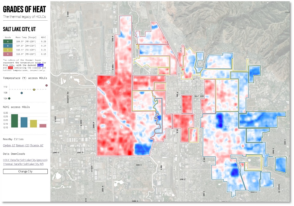
“The most interesting is all of the other factors that are contributing to these heat islands that aren’t necessarily directly visible in the images,” Krisch said. “But as soon as you start investigating a city it becomes immediately clear what’s happening. In Salt Lake City, for example, on the west side, you have huge amounts of mining industry.”
This industrial activity could explain why “the west side of Salt Lake City is hotter and it has way worse air quality,” Krisch said. “Those drivers are what has surfaced as being a really interesting opportunity to explore. I think that holds true from city to city. There’s a reason that it’s hotter in these communities, and I think one thing that’s helpful with this tool is it points you in the direction of where those drivers might be, whether it’s factories or mines or refineries, plants, whatever it is.”
About Big Local News
From its base at Stanford University, Big Local News gathers data, builds tools and collaborates with reporters to produce journalism that makes an impact. Its website at biglocalnews.org offers a free archiving service for journalists to store and share data.
Learn more by visiting our About page.


