How you can use climate finance data we collected for local stories around the globe
Temperatures continue to increase, extreme weather events are becoming more frequent and damaging, and the livelihoods of millions of people are at risk as sea levels rise. These are just some of the impacts of climate change.
With the goal of strengthening the global response to those threats, wealthy countries pledged financing to help developing countries cope with the impacts of climate change and to support them in building their economies with cleaner energy.
The financial promise was first made in 2009 and affirmed in the 2015 Paris Agreement.
Developed countries reported more than 40,000 direct contributions toward the finance target, totaling more than $182 billion, from 2015 to 2020, the last year for which data is available.
Where did that money go?
To answer that question, Big Local News and Reuters teamed up. We gathered the reports countries submitted to the United Nations and standardized the contributions, which include grants, loans, bonds, equity investments and other funding. The data comes from the last three UN Biennial Reports, comprising contributions made by wealthy countries between 2015 and 2020.
This data helped us find that countries are reporting funding for projects unrelated to climate change, such as Italy’s investment in chocolate stores and U.S. financing of hotel construction in Haiti. We found other investments that, instead of cutting emissions, would increase them, such as Japan’s financing of a new coal plant in Bangladesh and an airport expansion in Egypt. Check out the full investigation here.
None of this funding broke any rules, as developed countries and the U.N. have set no common definition of what counts as climate finance.
How you can analyze the data
Our reporting only scratched the surface; we examined about 10 percent of the projects listed in the U.N. reports. There is room for other journalists to continue this work.
Here are some initial steps to dig into the data:
The data that Reuters and Big Local News compiled and standardized is available for download from the Stanford Digital Repository. Download the CSV file ‘bln_reuters_climate_finance_2015to2020.csv,’ including the README that contains a data dictionary and explains the limitations of the data.
The biggest challenges reporters faced in working with this data were the lack of standardized reporting by developed countries and the vague nature of the records.
Some records include detailed descriptions that make clear where the funding went and what it paid for. Other reports are extremely vague and offer little insight into how money was spent. When exploring this database in search of a story, we recommend that you take into account its limitations: in some cases, the records do not mention a specific recipient. In others the description is limited to the name of a country, and some projects –as we discovered through subsequent reporting– never took place at all. The projects were canceled, but the UN reports were never updated.
With this in mind, this database can be a starting point to find out where wealthy nations are investing in climate finance, what sectors they are prioritizing and what financial leverage they are employing.
Here are some specific steps using Excel that you can follow to answer important questions about how this money is spent and what the implications are for climate change:
Which wealthy countries have reported the most climate finance contributions?
- Open your file in Excel.
- Select all the rows and columns.
- Click on ‘Insert’ on the menu bar at the top of your Excel workbook, select the ‘PivotTable’ icon from the Excel ribbon.
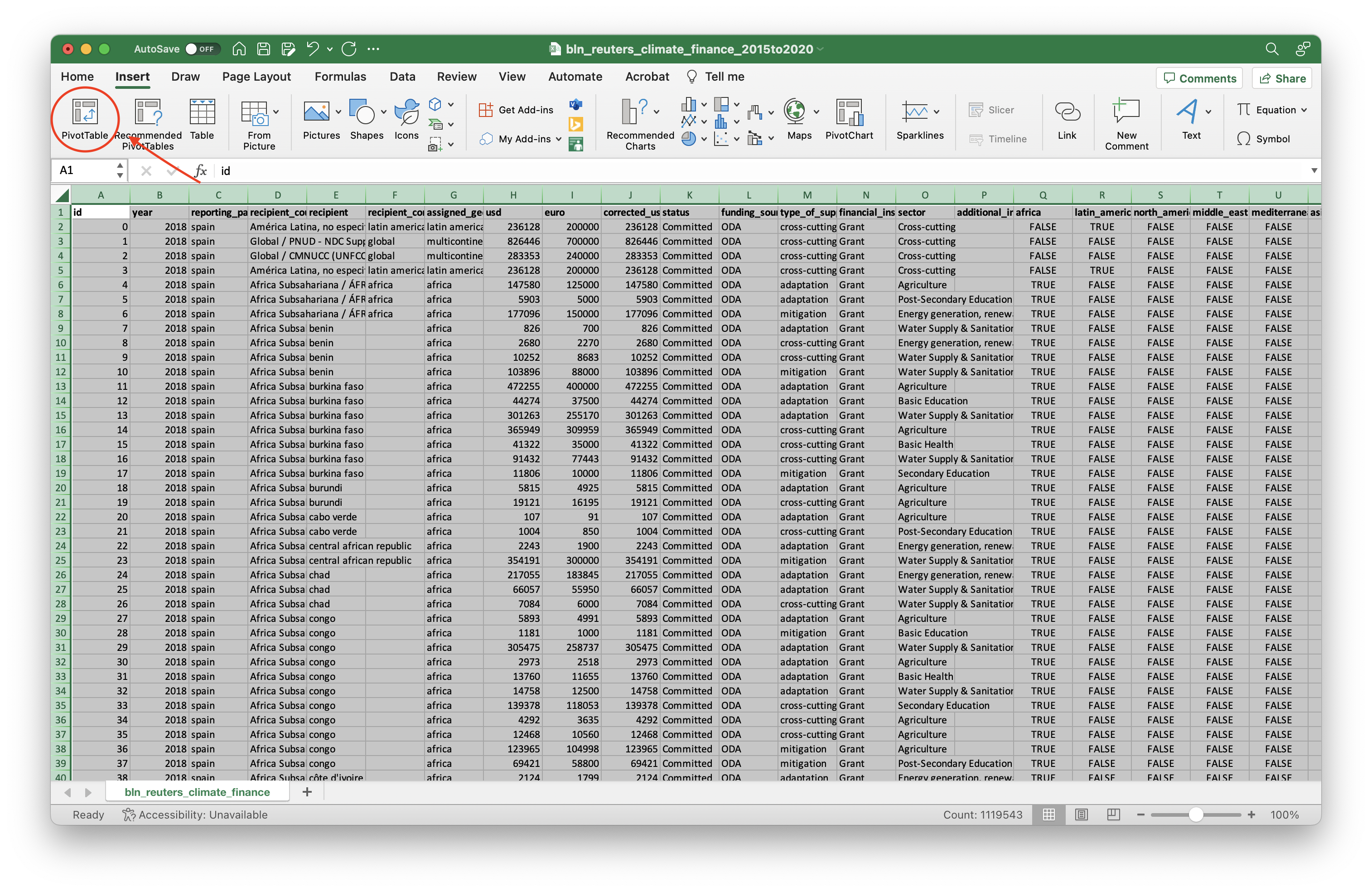
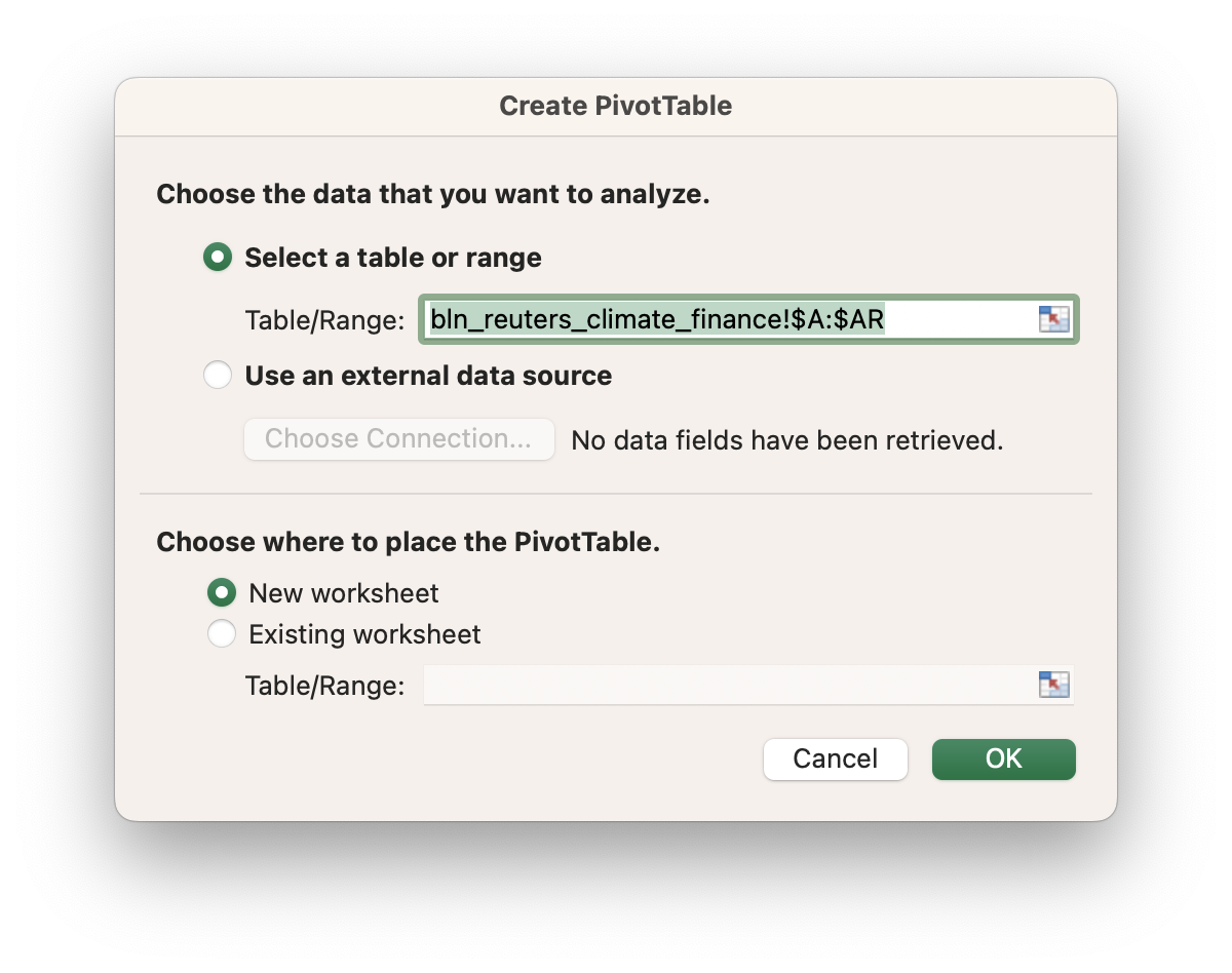
- You will get a prompt about where your ‘PivotTable’ will go in the workbook. You want to place your new table in a ‘New worksheet.’
- Select ‘reporting_party’ as your rows and ‘corrected_usd’ as your values, double check that this field is performing a sum.
- Click on ‘row labels,’ at the top of your new table, and sort by ‘corrected_usd’ in descending order.
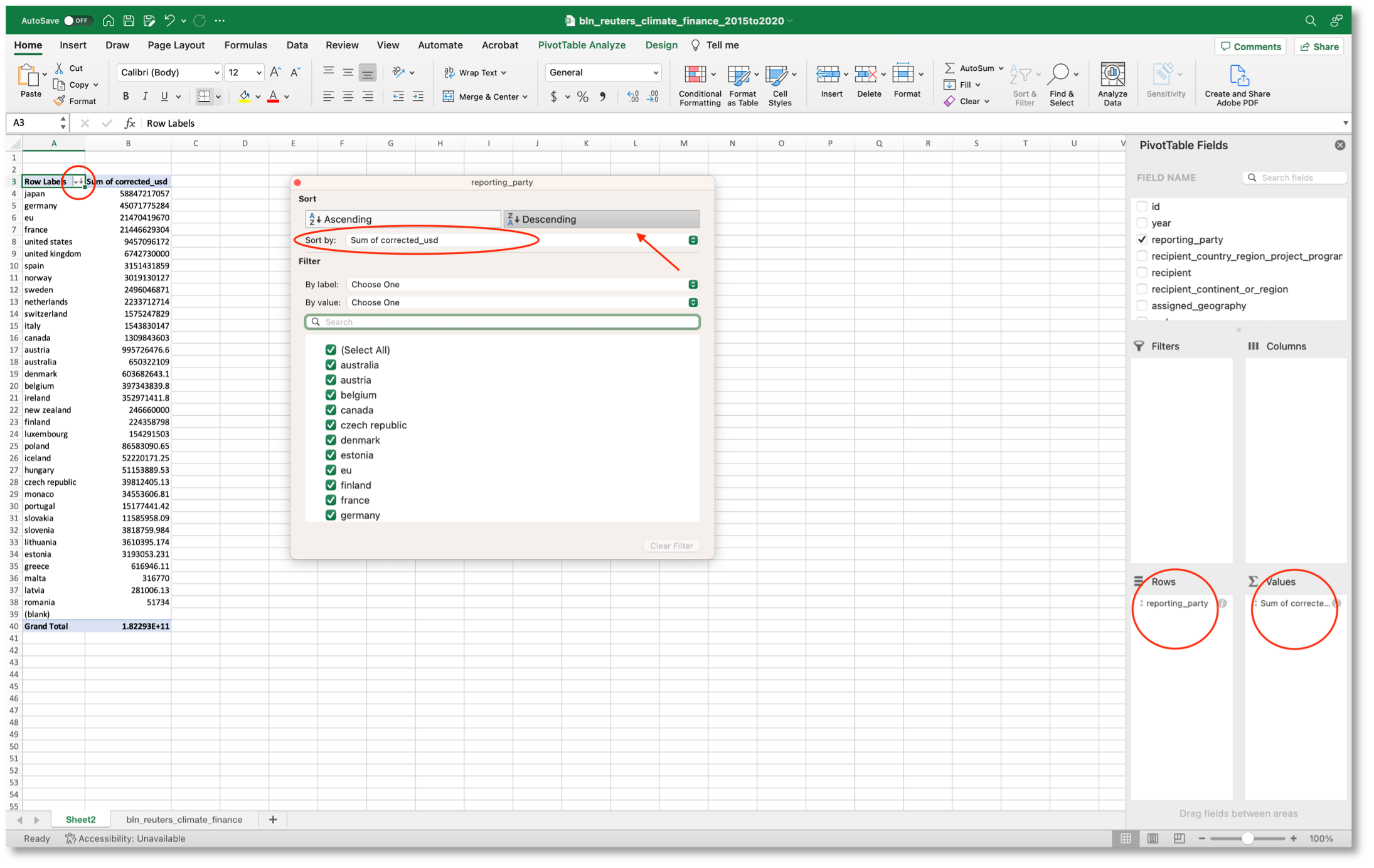
- Take a look: here is the list of reporting parties ordered by the amount of climate finance investment reported to the UN between 2015 and 2020.
Which developing countries have received the most climate finance contributions?
- Do not leave your ‘PivotTable,’ just drag the old value –‘reporting_party’– off of the ‘PivotTable.’ Now, place ‘recipient’ as your ‘rows’ and add ‘id’ among your values, double check that this field is performing a count.
- Click on ‘row labels,’ at the top of your new table, and sort by ‘corrected_usd’ in descending order.
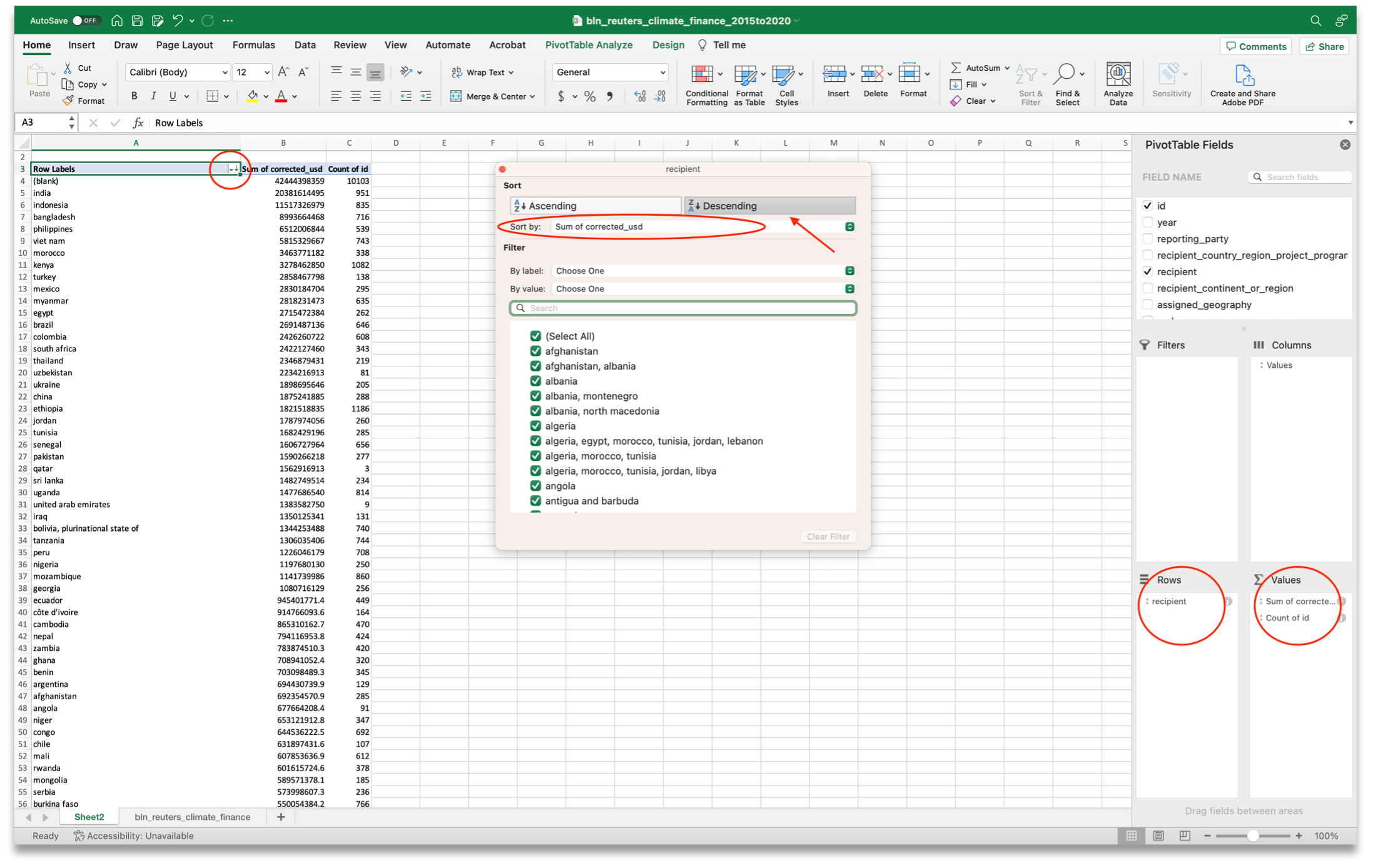
- Take a look: here is the list of recipient countries ordered by the amount of climate finance reported to the UN between 2015 and 2020.
- As you can see, you just found one of the limitations of the data: 10,103 records for more than $ 42 billion do not mention any specific country.
To which sector did the most contributions go?
- You will keep working with the ‘PivotTable’ to answer this question.
- Place ‘sector’ as your ‘rows’ –instead of ‘recipient’–.
- Click on ‘row labels,’ at the top of your new table, and sort by ‘corrected_usd’ in descending order.
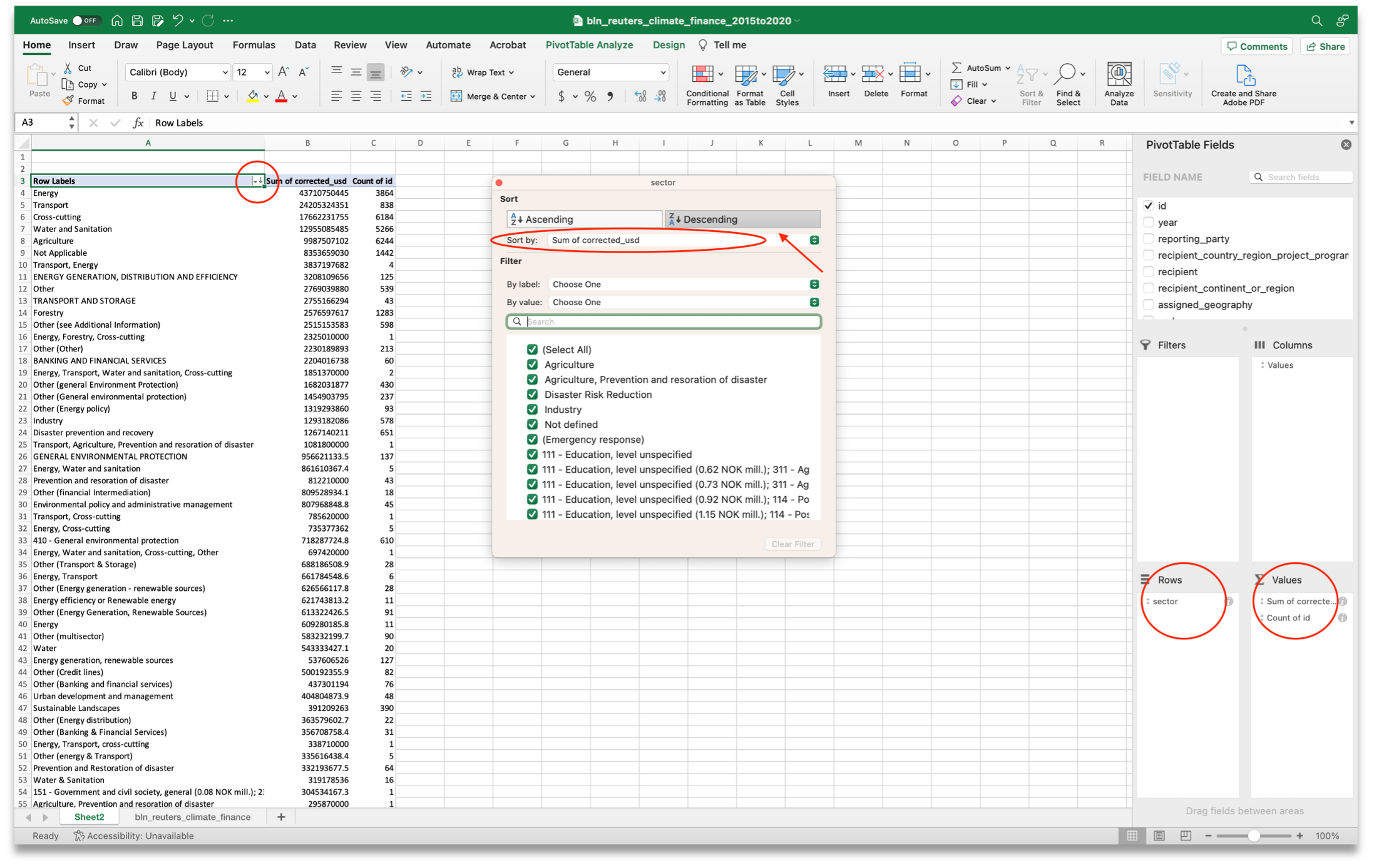
- As you can see, ‘energy,’ ‘transport,’ and ‘cross-cutting’ are the top three sectors. But, you have to take into account that the values of this column are not standardized –the reporters kept the raw data as it is, so those results are just a preliminary picture of the trends–.
Where is the United States investing its climate finance contribution?
- Do not leave your ‘PivotTable’ yet!
- Place ‘reporting_party’ as your ‘filter,’ ‘corrected_usd’ as your ‘values,’ and ‘recipient’ as your ‘rows.’
- At the top of your table, click the down arrow and select the country/party. We’ll select ‘United States.’
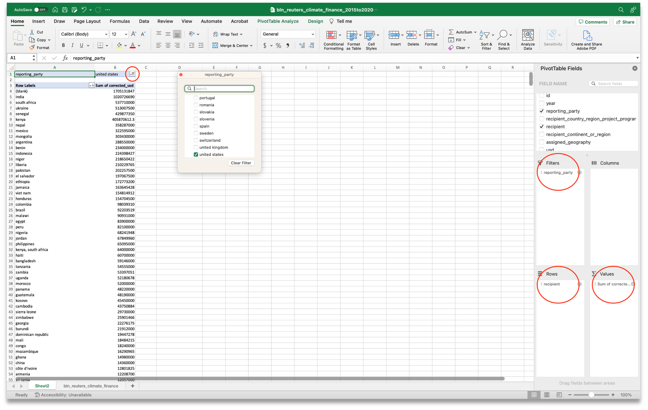
- Click on ‘row labels,’ at the top of your new table, and sort by ‘corrected_usd’ in descending order.
- As you can see, more than $1 billion of the United States investment cannot be linked to a specific country. But you can also see that India, South Africa, and Ukraine are the top three recipients.
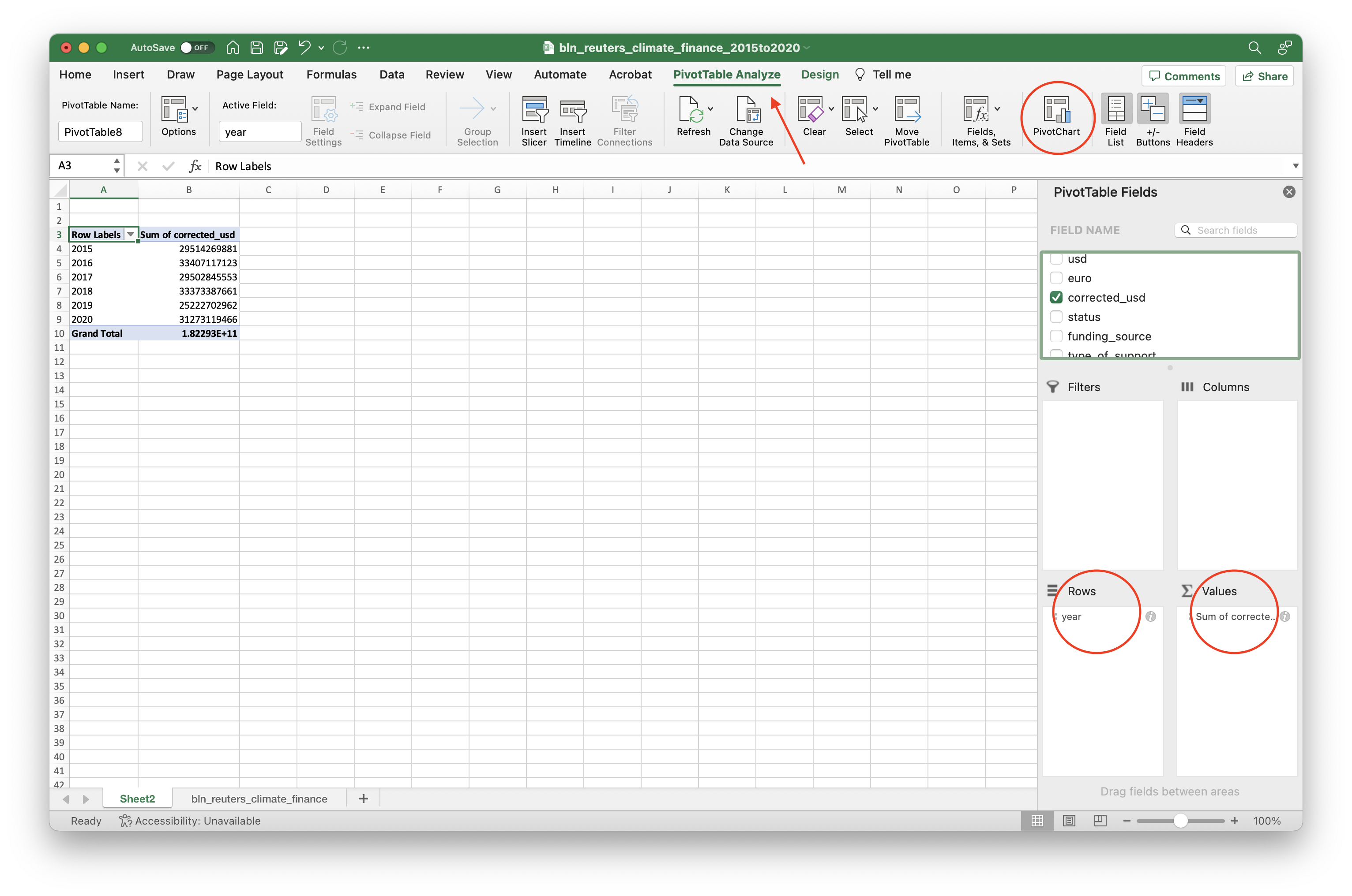
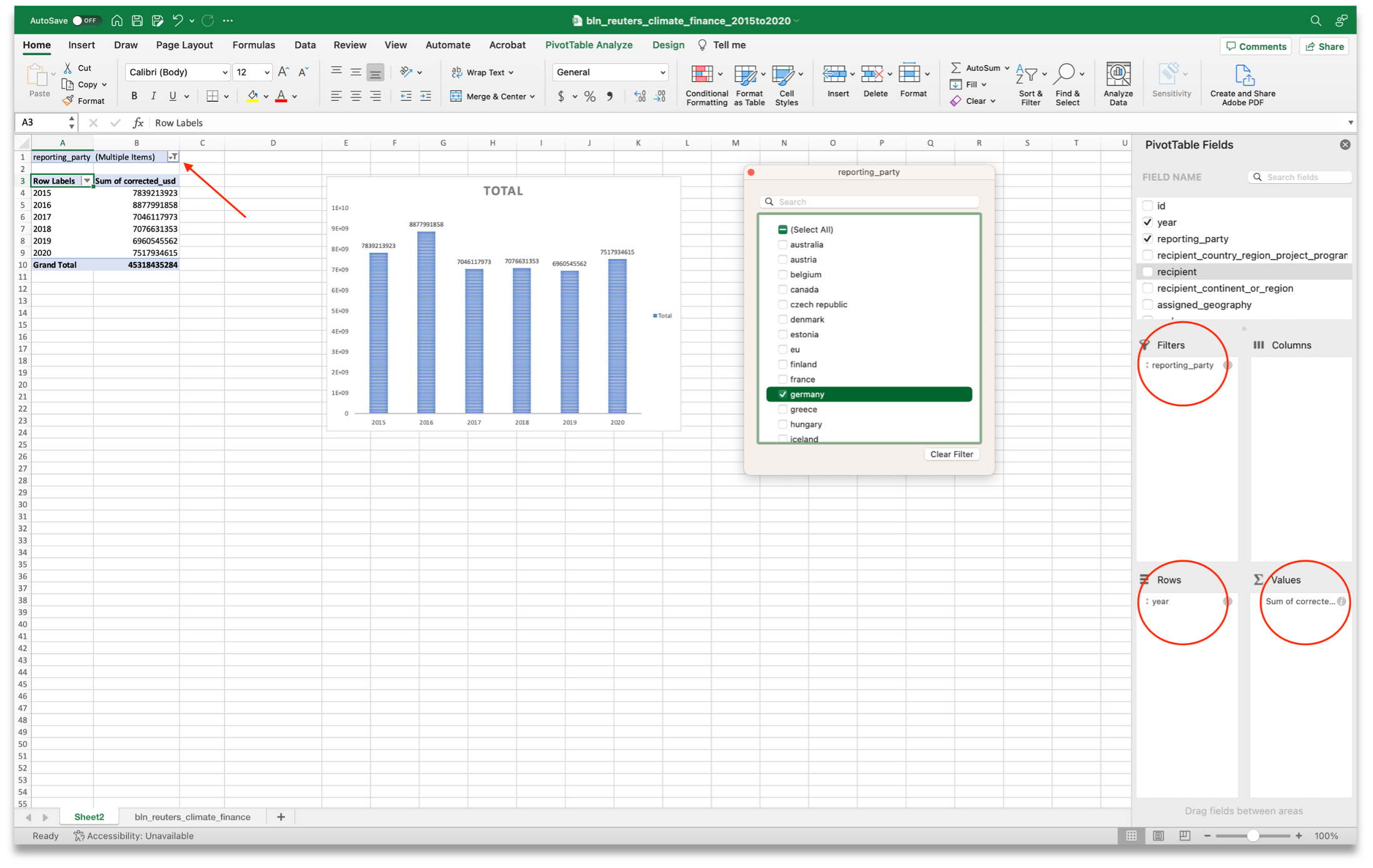
How have climate contributions changed over time?
- Keep working on your ‘PivotTable,’ just drag your old values off of the ‘PivotTable’ and place ‘year’ as your ‘rows’; and ‘corrected_usd’ as your values.
- As you can see, your ‘PivotTable’ now shows the total climate finance contributions per year, but it is hard to read. Let’s add an additional step.
- In your menu, you will find a tool called ‘PivotTable Analyze,’ click on ‘PivotChart.’
- Now, you have a chart with the total contributions per year. You can edit this chart to make it more readable by clicking on ‘Design’ (at the top of your menu as well).
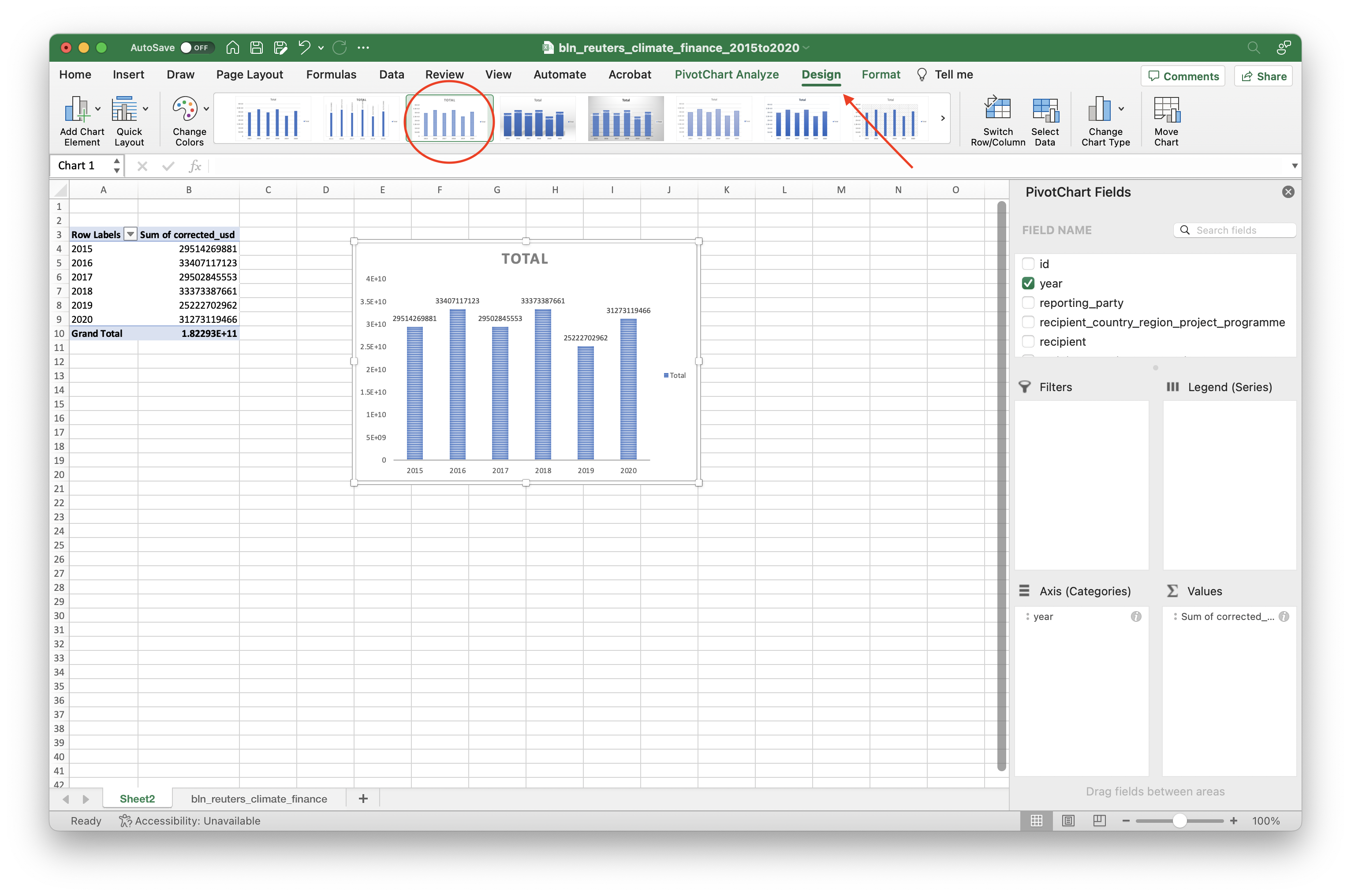
- Do you want to explore how the contributions of a specific wealthy nation have changed over time? Just drag ‘reporting_party’ to your ‘filters’ and select the ‘reporting_party’ that you want to explore. The chart will be updated automatically.
Bonus: Using the gathered documents
The main challenge of this database is the lack of detailed information on a large number of records:
- 17,753 records do not contain any ‘additional_information.’
- The ‘recipient_country_region_project_programme’ description of at least 8,620 records –which represents more than $65 billion of investment, more than a third of the total– is so vague that it is challenging to track the destination of the funds.
- 2,563 records, more than $10 billion of investment, do not specify the country or continent where the contributions were intended to go.
In an effort to overcome this data limitation and understand the real impact of those projects, we requested specific documentation about some of those projects from the donors. We hope these documents help with transparency and support other accountability journalism efforts. Our archive includes the gathered documents as well as this data. You can download both from the Stanford Digital Repository.
About Big Local News

From its base at Stanford University, Big Local News gathers data, builds tools and collaborates with reporters to produce journalism that makes an impact. Its website at biglocalnews.org offers a free archiving service for journalists to store and share data. Learn more by visiting our about page.


